Make sure to reach out to Tao Wang (twang1@swarthmore.edu) about registering
PS1 Due next Friday at 11:59pm!
Check out website
Agenda
What is econometrics?
What is causality?
What is data?
How do we visualize different data?
What is econometrics?
Econometrics revolves around statistical methods to answer economic problems
What is the demand of laptops?
How do taxes affect GDP?
What is the elasticity of labor supply?
EC001 taught you a lot about the theory of economics
But are any of these things actually true?
And if so, what IS the elasticity of X or the multiplier of X?
How big is it? Does it even matter?
What is the difference between econometrics and statistics
To answer many of the questions in the last slide, you need to know impact
How does one thing affect another?
How does one thing causally affect another?
What is causation?
What is correlation?
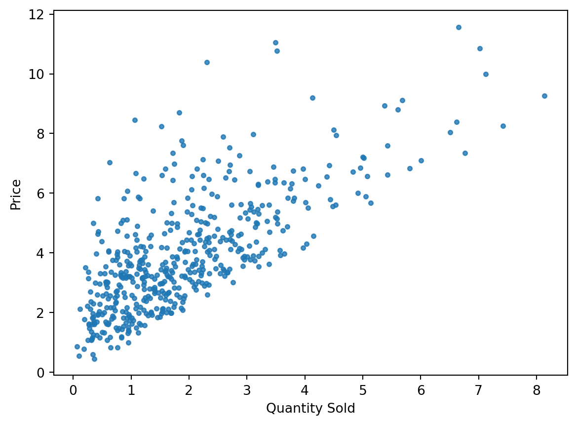
Motivating Example: Supply and Demand
Suppose you want to estimate demand for a product, tomatoes in Swarthmore
You collect data every day from each supermarket, farmers market, and local grocery store over the course of a month.
These organization give you data on how many tomatoes they sold that day (quantity, Q) and the price they sold them at (P)
In the end, you have this data:
Text(0, 0.5, 'Price')
What can you say about this data?
Can you say something about demand or supply?
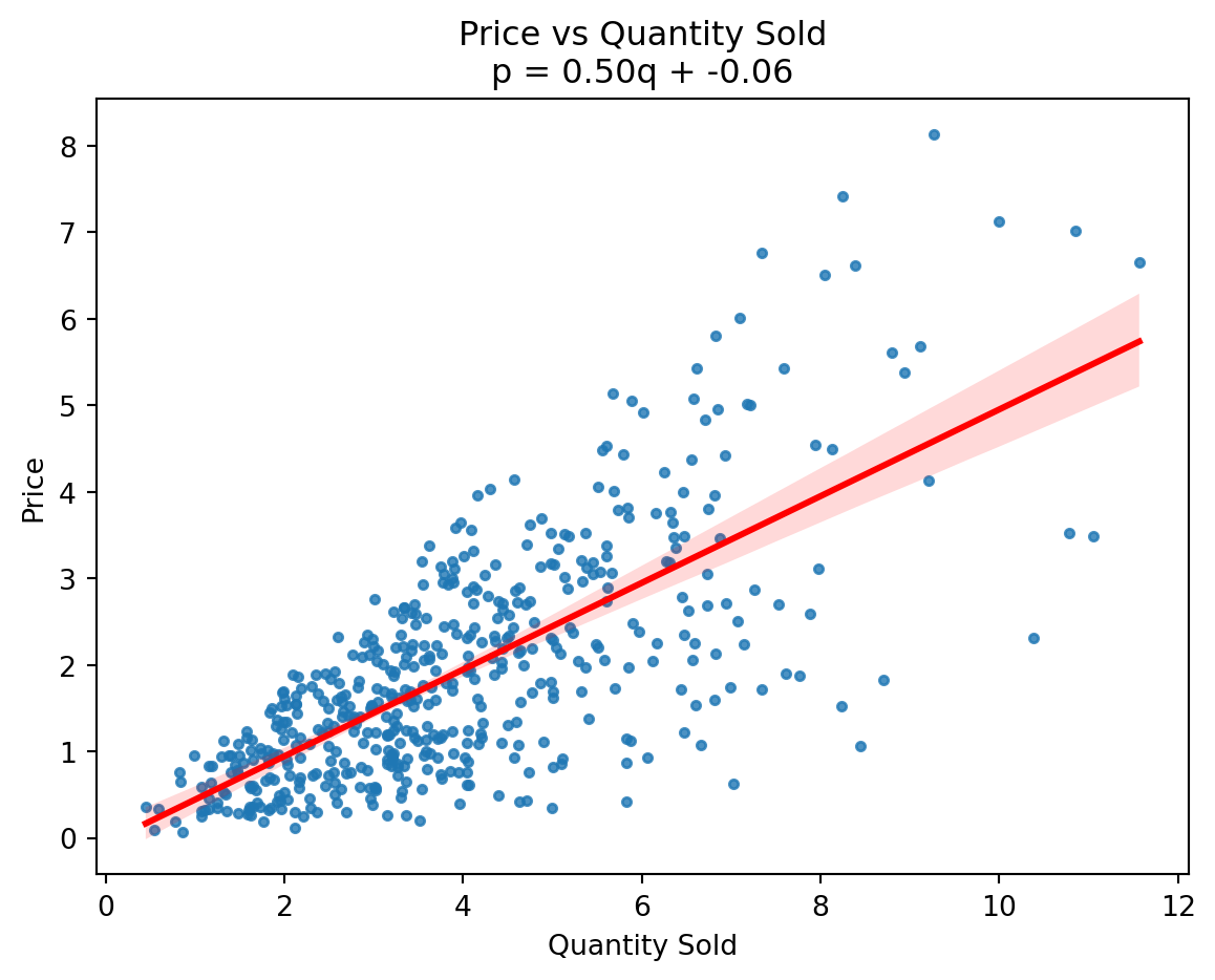
Supply and Demand
Let’s say I draw a line through the data.
The “best-fit” line.
Text(0, 0.5, 'Price')
Supply and Demand
What does that line represent?
What does the slope tell you?
If I asked you: “What is the effect of increasing quantity sold by 1 unit on price?”
What if I asked you, instead: “What is the effect of increasing price by 1 on unit on quantity demanded?”
Supply and Demand
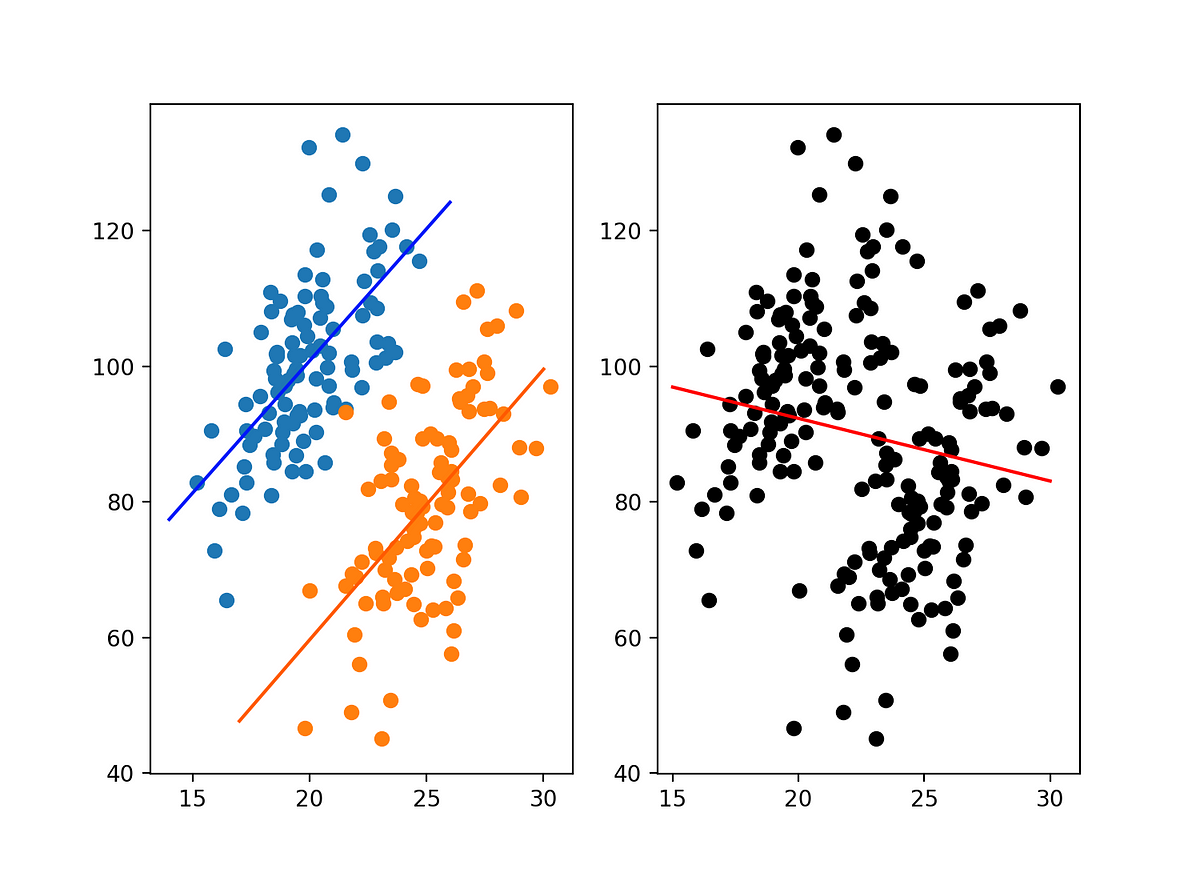
Remember that the intersection of supply and demand determines the price and quantity sold
So each point on this graph is not supply or demand, it’s actually an equilibrium point!
Can we really learn about demand or supply from this data alone?
What would we need in order to isolate demand or supply?
Take 5 minutes to think about this with your neighbor.
Correlation
Correlation is about data moving together
It doesn’t necessarily mean that one causes the other
Correlation is still useful, especially for prediction
Machine learning/neural networks
You can also think of the best-fit line here as an estimate of “the conditional expectation function” (more later)
Correlation
What is causation?
That’s actually a pretty philosophical question…
What is causation?
Hume’s Belief on Knowledge and Experience: Our beliefs about general principles (e.g., “the sun will rise tomorrow” or “bread is nourishing”) are derived from experience. This justification is inadequate, as previous experiences do not logically guarantee future occurrences.
Impact on Philosophy and Practical Fields: Hume’s skepticism about causation influenced subsequent philosophy and posed challenges in science, law, policy, and other fields.
Causality in the Social Sciences
In physics, the question of causality isn’t as big of a problem
The causal relationships between atoms and forces seem much more apparent because atoms can’t choose to be affected by a force, or even change the force
But what does causation mean with social phenomena?
A treatment (force) can be chosen, or denied
Selection
People adapt and can “game” the system
How do you isolate causality?
In economics, we often think about “threats to identification”
What could be confounding my causal relationship?
Everything might be…
Selection
Suppose you want to understand the causal impact of providing mosquito nets to households in countries with high malaria incidence (perhaps, Ghana)
You decide to bring some mosquito nets to various villages in Ghana and let anyone who wants them, take one.
Then you collect data from those that took mosquito nets and those that didn’t and wrote down whether they got malaria or not in the next two weeks.
Let’s look at some data…
My calculation
What happened?
This should be easy.
All we have to do is take the average risk of those who took the nets and the average risk of those who didn’t.
We subtract the two and voila! Causal impact.
Did you get Malaria (Yes (1)/No(0))
Takers
Non-takers
1
1
0
0
0
0
0
0
0
0
1
0
0
0
0
0
0
0
0
0
Mean of takers: 20%
Mean of non-takers: 10%
Impact: 20-10 = +10% ?!
What is a counterfactual?
This isn’t some math trick or contrived example.
Many econometricians like to talk about “counterfactuals.”
What would that world look like?
What would have been the chances of getting malaria in the absence of getting the nets?
Back to the example
What is the counterfactual in the mosquito nets example?
What would have happened had mosquito nets not been provided?
Selection counfounded the impact
Group
Counterfactual malaria risk
Effect of nets
Observed malaria risk
High-risk area (take nets)
40%
Nets cut risk in half
20%
Low-risk area (don’t take nets)
10%
No nets → 10%
10%
Back to econometrics vs. statistics
Econometricians really delve deeply into causation
They care about what assumptions need to be made about the data generating process that will allow them to say that some model’s measure is a causal impact/measure/effect
Often econometrics involves thinking about counterfactuals and that involves simplification and modeling
Statistics concerns the collection, organization, analysis, interpretation, and presentation of data.
All models are wrong, but some are useful
All models are a simplification
But they give us the benefit of being able to generalize and say something about the data generating process
But at the cost of reducing a truly complex thing into a less “true” form
That’s why in statistics/econometrics, our estimates always come with a measure of uncertainty. The first usually a point estimate and then a confidence interval or standard error.
DGPs
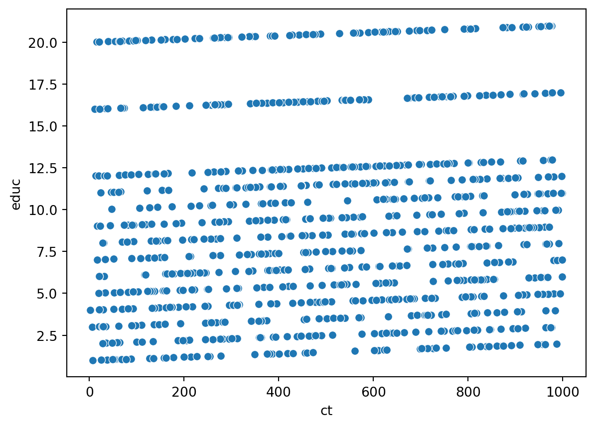
Suppose we know want to look at the effect of a cash transfer to a low-income household on educational outcomes 5 years later.
The true data-generating process for that is incredible complex.
It includes things like:
Household characteristics
Local labor market conditions
Quality of schools
Parental education
Peer effects
The amount of cash transfer
The effect of random shocks (weather, health, etc) in the next 5 years
DGPs
We can make a simplification, by adding structure:
This complicated social phenomenon can be represented as a probability distribution of various random variables
This can be represented as some joint distribution of all these variables, interrelating with each in complicated and non-linear ways.
Imagine a multi-dimensional surface where each axis is one of these variables.
Simplifying the DGP
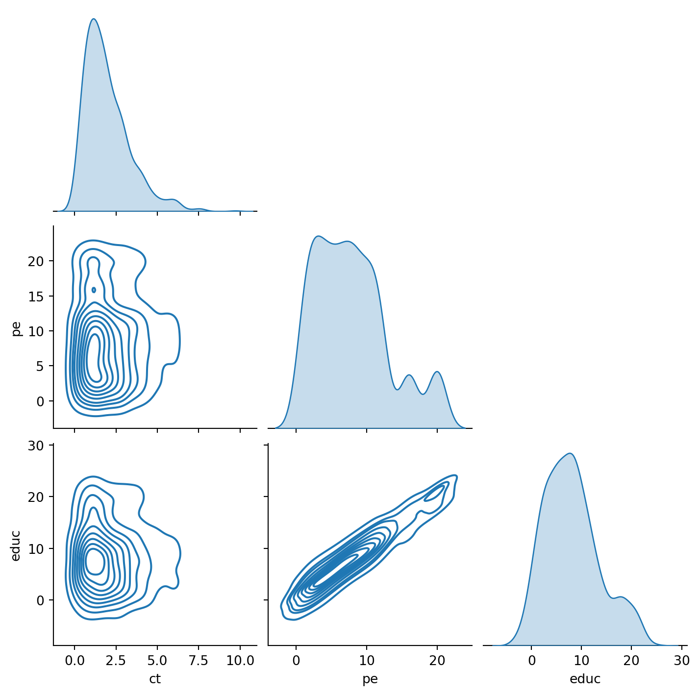
Let’s make an assumption: education in five years only depends on the cash transfer and your parent’s education.
What would that joint distribution look like?
What do we lose by making this assumption?
This is now a model.
We can visualize this in two dimensions with a pairplot.
Simplifying the DGP Further
The degree of simplification is dependent on how you want to answer a particular question.
With the pairplot above, we can see the rich interactions between cash transfer, parental education, and education, at the cost losing out on the complexity of the full DGP.
But what if what you really wanted to answer: “What is the average impact of a cash transfer on education, holding parental education constant?”
Then you can add even more structure to the DGP, by also assuming how cash transfer affects education.
The cash transfer (CT) is linearly related to education.
The impact of the cash transfer is \(\beta_1\)
This means that as we increase the cash transfer by $1, education will go up by \(\beta_1\) units
More on this later.
What is Data?
Data is assumed to be coming from data generating process
The DGP generates elements of data of a variable, which we see as observations.
A data generating process is not usually known
All we can do is try to understand it better through the data it generates
But data generating processes have observable characteristics
Distributions
Models
A model is some simplified representation of the data generating process
It provides us with a way to make claims about the data in a more formal, structured way
Data Collection
Suppose we wanted to answer this question and decided to collect data
What are the different data types we could collect for this?
The first level: Quantitative vs. Categorical Data
Quantitative Data
Quantitative data indicate how many or how much.
Ordinary arithmetic operations are meaningful for quantitative data.
i.e. “5 years of education, $1000 in CT”
Categorical Data
Labels or names are used to identify an attribute of each element
Often referred to as qualitative data
“High Education, Low Education, No education”
Ordinal vs. Nominal
The categories in categorical data can have ordering or just be a set
Nominal Data: Labels or names used to identify an attribute
Ordinal Data: Categories where the rank and ordering matters.
Example
Economics, Business, Physics… -> Nominal
Freshman, Sophomore, Junior, Senior -> Ordinal
Data Collection
Now that you know what kind of data types there are, what kind of data would you want to collect to answer this question:
What’s the ideal type? Why?
Education -> ?
Cash Transfer -> ?
Observation Levels
What does each row or observation represent in your data? A person, a time period, a person at some time period in some region, etc…
Most data can be broken down into:
Crossection
Time Series
For the future: panel data
Crossectional Data
Data collected at the same or approximately the same point in time.
Example Data detailing the number of building permits issued in November 2013 in each of the counties of Ohio.
Crossectional Data
Time Series
Data collected over several time periods.
Example
Data detailing the number of building permits issued in Lucas County, Ohio, in each of the last 36 months.
Time Series
Data Sources/Collection
Data can be collected from administrative data:
Internal company records
Business databases
government agencies
Publicly available surveys
BLS
Census
LSMS
Or collect it yourself!
Popular today with RCTs
Types of Statistical Studies
Statistical Studies – Observational
In observational (nonexperimental) studies no attempt is made to control or influence the variables of interest.
Example – Survey
Studies of smokers and nonsmokers are observational studies because researchers do not determine or control who will smoke and who will not smoke.
Types of Statistical Studies
Statistical Studies – Experimental
In experimental studies the variable of interest is first identified. Then one or more other variables are identified and controlled so that data can be obtained about how they influence the variable of interest.
The largest experimental study ever conducted is believed to be the 1954 Public Health Service experiment for the Salk polio vaccine. Nearly two million U.S. children (grades 1 through 3) were selected.
Observational vs. Experimental
This is a particularly important distinction in the causal inference world
Experiments allow you to isolate the effects of your intervention so that you know that the channel is causal
Observational studies often have confounders, which are factors that are related to both you outcome of interest and to the intervention you are studying.
How could you know whether it was your intervention or something else?
Our example
What would be an example of how to make our study of cash transfers on education experimental?
What would be an example of that study being observational?
Big Data and Data Mining
Big data: Large and complex data set.
Three V’s of Big data:
Volume: Amount of available data
Velocity: Speed at which data is collected and processed
Variety: Different data types
Data Mining
Methods for developing useful decision-making information from large databases.
Using a combination of procedures from statistics, mathematics, and computer science, analysts “mine the data” to convert it into useful information.
The most effective data mining systems use automated procedures to discover relationships in the data and predict future outcomes prompted by general and even vague queries by the user.
Data Mining Applications
The major applications of data mining have been made by companies with a strong consumer focus such as retail, financial, and communication firms.
Data mining is used to identify related products that customers who have already purchased a specific product are also likely to purchase (and then pop-ups are used to draw attention to those related products).
Data mining is also used to identify customers who should receive special discount offers based on their past purchasing volumes.
Data Mining Reliability
Finding a statistical model that works well for a particular sample of data does not necessarily mean that it can be reliably applied to other data.
With the enormous amount of data available, the data set can be partitioned into a training set (for model development) and a test set (for validating the model).
There is, however, a danger of overfitting the model to the point that misleading associations and conclusions appear to exist.
Careful interpretation of results and extensive testing is important.
Ethical Guidelines for Statistical Practice
In a statistical study, unethical behavior can take a variety of forms including:
Improper sampling
Inappropriate analysis of the data
Development of misleading graphs
Use of inappropriate summary statistics
Biased interpretation of the statistical results
One should strive to be fair, thorough, objective, and neutral as you collect, analyze, and present data.
As a consumer of statistics, one should also be aware of the possibility of unethical behavior by others.
Summarizing Categorical Data
Frequency Distributions
Relative Frequency Distributions
Percent Frequency Distributions
Bar Charts
Pie Charts
Histograms
Frequency Distributions
A frequency distribution is a tabular summary of data showing the number (frequency) of observations in each of several non-overlapping categories or classes.
Example: Marada Inn Guests staying at Marada Inn were asked to rate the quality of their accommodations as being excellent, above average, average, below average, or poor.
Rating
Frequency
Poor
2
Below Average
3
Average
5
Above Average
9
Excellent
1
Total
20
Relative Frequency and Percent Frequency Distributions
The relative frequency is the proportion of of the total number of data items in some groups
The percent frequency is that frequency multiplied by 100
Rating
Relative Frequency
Percent Frequency
Poor
0.10
10%
Below Average
0.15
15%
Average
0.25
25%
Above Average
0.45
45%
Excellent
0.05
5%
Total
1.00
100%
Bar Chart
A bar chart is a graphical display for depicting qualitative data.
A frequency, relative frequency, or percent frequency scale can be used for the other axis (usually the vertical axis).
Using a bar of fixed width drawn above each class label, we extend the height appropriately.
The bars are separated to emphasize the fact that each class is a separate category.
Pie Chart
The pie chart is a commonly used graphical display for presenting relative frequency and percent frequency distributions for categorical data.
First draw a circle; then use the relative frequencies to subdivide the circle into sectors that correspond to the relative frequency for each class.
Because there are 360 degrees in a circle, a class with a relative frequency of 0.25 would consume 0.25(360) = 90 degrees of the circle.
Summarizing Quantitative Data
Frequency Distribution
Relative Frequency and Percent
Frequency Distributions
Dot Plot
Histogram
Cumulative Distributions
Stem-and-Leaf Display
Dot Plots
One of the simplest graphical summaries of data is a dot plot.
A horizontal axis shows the range of data values.
Then each data value is represented by a dot placed above the axis.
Cross-tabulation
Many times, you want to look at how two or more variables can be summarized
For this you can use cross-tabulation
Example: Finger Lakes Homes
The number of Finger Lakes homes sold for each style and price for the past two years is shown below.
Example: Finger Lakes Homes
Insights
The greatest number of homes (19) in the sample are a split-level style and priced at less than $250,000.
Only three homes in the sample are an A-Frame style and priced at $250,000 or more.
Row and Column Percentages
Converting the entries in the table into row percentages or column percentages can provide additional insight about the relationship between the two variables.
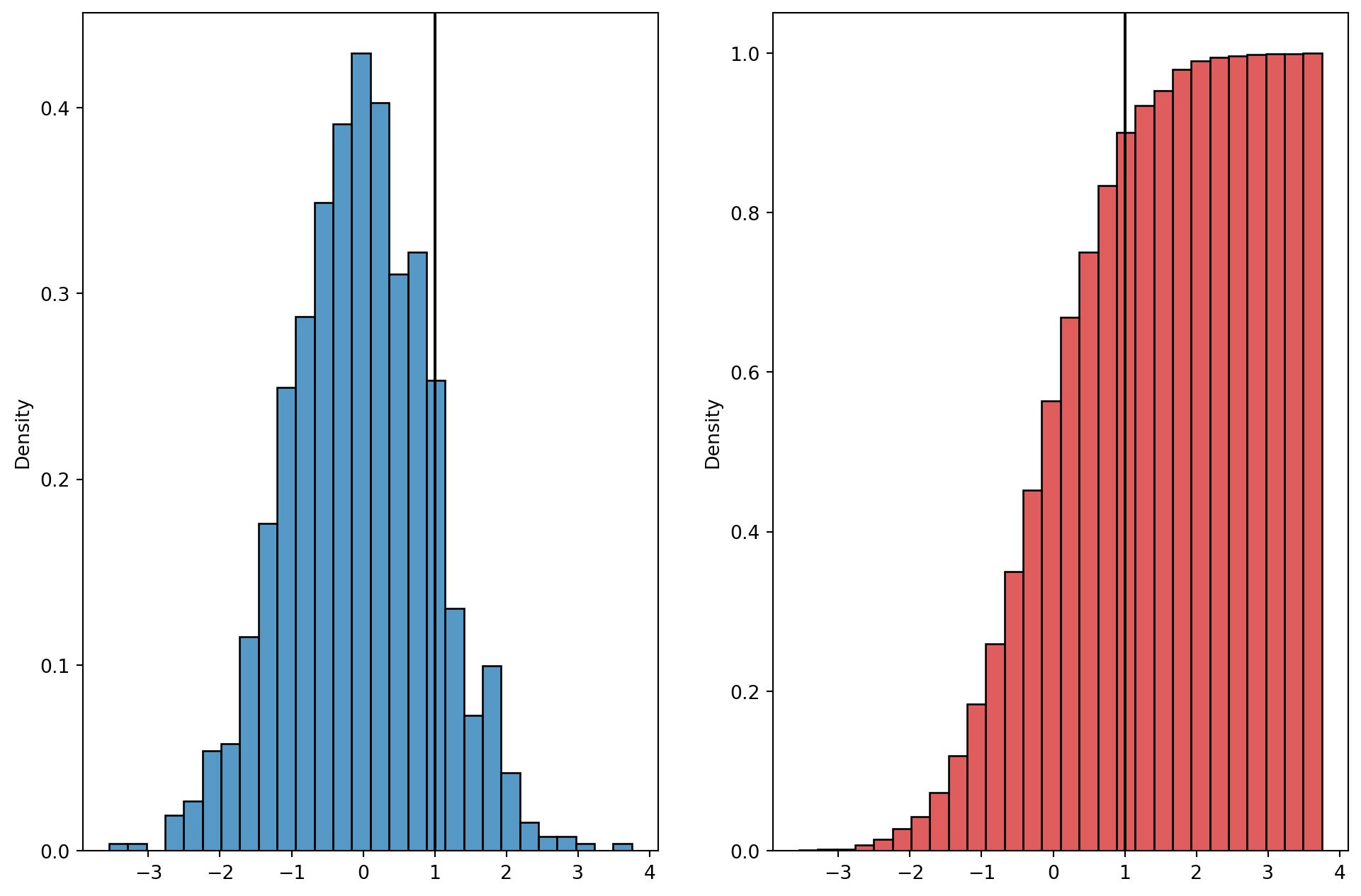
Histogram
The variable of interest is placed on the horizontal axis. A rectangle is drawn above each class interval with its height corresponding to the interval’s frequency, relative frequency, or percent frequency. Unlike a bar graph, a histogram has no natural separation between rectangles of adjacent classes.
Histogram Skewness
Cumulative Distributions
Cumulative Distribution
So let’s take the table for car repairs:
Parts Cost ($)
Frequency
Percent Frequency
50-59
2
4%
60-69
13
26%
70-79
16
32%
80-89
7
14%
90-99
7
14%
100-109
5
10%
TOTAL
50
100%
How would we turn this into a cumulative distribution?
Cumulative Distribution
Parts Cost ($)
Frequency
% Frequency
Cumulative Frequency
Cumulative % Frequency
50-59
2
4%
2
4%
60-69
13
26%
2 +13 = 15
4+26 = 30%
70-79
16
32%
15 + 16 = 31
30 + 32 = 62%
80-89
7
14%
31 + 7 = 38
62 + 14 = 76%
90-99
7
14%
38 + 7= 45
76 + 14 = 90%
100-109
5
10%
45 + 5 = 50
90+ 10 =100%
TOTAL
50
100%
Simpson’s Paradox
Data in two or more crosstabulations are often aggregated to produce a summary crosstabulation.
We must be careful in drawing conclusions about the relationship between the two variables in the aggregated crosstabulation.
In some cases the conclusions based upon an aggregated crosstabulation can be completely reversed if we look at the unaggregated data. The reversal of conclusions based on aggregate and unaggregated data is called Simpson’s paradox.
Scatterplots and Trendlines
Scatterplots can show us a clearer sense of the relationships between variables
“Ocular econometrics”
It’s also easier to spot strageness that can be investigated further
ex: Simpson’s paradox
Scatterplots and Simpson’s Paradox
Creating Effective Visualizations
Creating effective graphical displays is as much art as it is science.
Here are some guidelines:
Give the display a clear and concise title.
Keep the display simple.
Clearly label each axis and provide the units of measure.
If colors are used, make sure they are distinct.
If multiple colors or line types are used, provide a legend.
Misleading graphs
Each graph you ever make is trying to convey some point
What are you trying to say?
There is a balance between trying to convey some point, and risking misleading graphs to make it
Scales in bar graphs
Bar graphs are great because you can convey information in a digestible way
But changing the scales to suit your needs is misleading
Unconventional Visualizations
Unclear Plots
Each plot you make should be self-contained
I shouldn’t have to listen to a broadcast, read a book, or listen to a lecture to understand a particular plot
Make visualizations that are clear in what they are showing